


Why Architects Choose Specific Mailbox Shapes and Colors
A mailbox is far more than a functional necessity. For architects, it is a subtle but important design element—one that completes the overall appearance of a home. Shape, color, and material are carefully selected to complement architectural style, enhance curb appeal, and create visual harmony with the facade.
1. Form follows function – with architectural intent
The architectural principle “form follows function” also applies to mailboxes—but with a strong design focus. Clean lines, balanced proportions, and seamless integration into the building envelope are key considerations.
- Modern homes: Minimalist, rectangular forms with flush or wall-integrated designs.
- Traditional architecture: Softer edges or classic proportions for a timeless look.
- Built-in mailboxes: Ideal when a calm, uninterrupted facade is desired.
Architect’s note: Mailbox placement and recess depth are often planned early to avoid compromises later in the construction process.
2. Color as an architectural statement
Color plays a major role in how architecture is perceived. Architects use mailbox colors to either create contrast or reinforce a cohesive design language.
- High contrast: Dark mailboxes (black, charcoal) against light facades add depth.
- Tone-on-tone: Matching facade and mailbox colors creates calm and elegance.
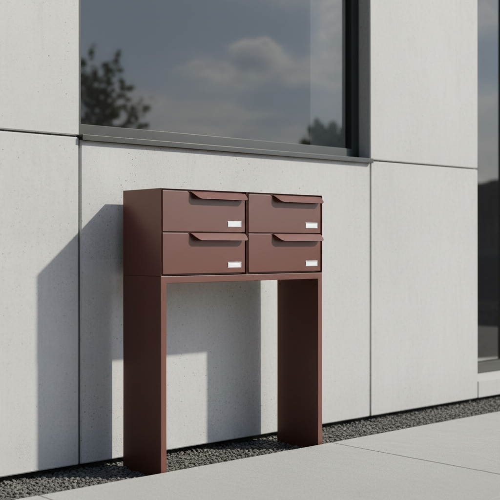
- Material-driven color: Stainless steel feels technical and modern, while bronze or copper adds warmth.
Matte powder-coated finishes are particularly popular, as they reduce glare and provide a durable, long-lasting surface.
3. Material choice as a marker of quality
Architects see material selection as a conscious quality decision—it influences both aesthetics and longevity at the home’s entry point.
| Material | Characteristics |
|---|---|
| Stainless steel | Modern, corrosion-resistant, timeless |
| Powder-coated aluminum | Lightweight, durable, color-stable |
| Corten steel | Distinctive, architectural, industrial character |
| Concrete / natural stone | Unique, sculptural, used selectively |
A high-quality mailbox signals attention to detail and craftsmanship—values shared by both architects and homeowners.
4. Integration into the overall architectural concept
Increasingly, mailboxes are designed as part of a complete entry system. House numbers, lighting, doorbells, and mailboxes are coordinated to create a unified visual identity.
Many architectural projects specify matching finishes across all entry elements—demonstrating precision and consistency down to the smallest detail.
5. Architecture psychology – color and perception
Colors influence emotions and convey subtle messages:
- Black & charcoal: strong, confident, contemporary
- White & silver: clean, precise, minimalist
- Bronze & copper: warm, inviting, premium
- Accent colors: bold shades add creative highlights
The mailbox is often the first physical interaction visitors have with a home—and it leaves a stronger impression than many realize.
Conclusion: the mailbox as an architectural detail
A thoughtfully chosen mailbox proves that design and function can work together seamlessly. For architects, it is a small but meaningful statement—a visible extension of the home’s architectural identity.
Explore Bravios Design Mailboxes